A retail map covered in brand logos but sitting on a default Google Maps background looks unfinished. The difference between an amateur map and a professional one often comes down to styling - the map base, the color palette, the highway treatment, and the label choices. These details signal that you've put thought into the presentation, which reflects directly on how prospects perceive the property and your brokerage.
This tutorial walks through every customization option available in CRE Retail Maps and explains how to use them to create branded, consistent maps across your entire portfolio.
Choosing the Right Map Style
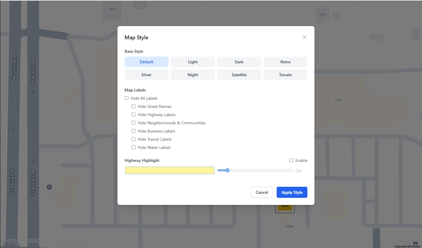
CRE Retail Maps offers nine map styles, each suited to different presentation contexts. Choosing the right base map is one of the biggest visual decisions you'll make.
Default - The standard Google Maps look. Familiar and readable, but not particularly distinctive. Use it when you want the map to feel neutral and let the logos do the talking.
Subtle - A restrained basemap that reduces visual competition from roads and background features. Use it when overlays and annotations should carry most of the visual weight.
Light - A clean, muted base with soft grays and whites. Evaluate it for OMs and property flyers when you want geographic context without strong background competition.
Dark - A deep charcoal background with light-colored roads and labels. Creates a striking, modern look that works well for urban properties, entertainment districts, and upscale retail. Logos pop against the dark background.
Retro - Warm, muted tones inspired by vintage cartography. Gives maps a distinctive character that stands out from the typical CRE map. Works well for historic districts or properties with architectural character.
Silver - Similar to Light but with cooler undertones. A good middle ground when Light feels too warm and Dark feels too dramatic. Clean and corporate.
Night - Deep blues and blacks with neon-tinged road labels. Similar energy to Dark but with more color. Best for properties in nightlife or entertainment-focused areas.
Satellite - Real aerial imagery. Essential when you need to show the physical property, parking, landscaping, or building footprints. Use this when the aerial perspective tells a story that a street map cannot - for example, showing a property's visibility from a highway or the density of surrounding development.
Terrain - Topographic styling that shows elevation changes and natural features. Useful for properties where terrain matters - hillside retail, waterfront locations, or properties near parks and natural amenities.
The general rule: If the map is going into a formal document (OM, brochure, flyer), start with Light or Silver. If the map is for a digital presentation or social media, Dark and Night create more visual impact on screens.
Setting Your Color Palette
Color consistency is what separates a one-off map from a branded asset. CRE Retail Maps provides two approaches to color selection.
12 preset color swatches cover a range of common presentation colors - professional blues, corporate grays, bold reds, and clean greens. Review the result against the map style you selected because contrast changes from one basemap to another.
Custom color controls let you enter an exact brand hex code in applicable container, text, leader-line, shape, and highway-highlight settings. These controls are separate, so apply and review the value in each element that should use it.
Colors apply to several map elements:
- Drag-to-group container borders and headers - The grouped tenant boxes that organize logos into labeled clusters.
- Leader line colors - The connector lines between logos and their map locations.
- Highlight overlays - Any colored overlays used to emphasize specific areas or parcels.
To keep a portfolio visually consistent, record the approved hex values and reapply them in the relevant controls on each map, then review contrast against the selected base style.
Highway Highlighting
Highways are the arteries of retail real estate. Visibility from a major road, proximity to an interchange, or access via an arterial - these are selling points that deserve visual emphasis.
CRE Retail Maps lets you customize highway highlighting with three controls:
- Color: Match the highway highlight to your brand color or use a contrasting color to draw attention to key routes.
- Weight: Adjust the line thickness. Thicker lines for major highways, thinner for secondary roads. This creates a visual hierarchy that guides the viewer's eye.
- Opacity: Control transparency so the highway highlight enhances the map without obscuring underlying detail. A semi-transparent highlight (60-80% opacity) usually strikes the right balance.
A practical approach: highlight the one or two roads most relevant to your property's access and visibility story. Don't highlight every road - it dilutes the emphasis and clutters the map.
Label Controls
Not every label on a map is relevant to every presentation. CRE Retail Maps gives you granular control over which labels appear:
- Street labels - Usually on. Turn off only if the map is zoomed out enough that street names become illegible clutter.
- Highway labels - Keep on for properties where highway access is a selling point. Turn off if highways aren't part of the location story.
- Area labels - Neighborhood and district names. Useful for establishing context ("Downtown Phoenix," "River North") but can be turned off for tighter, more focused maps.
- Business labels - The default Google Maps business names. Turn these off. Your placed logos and leader lines replace this function with much higher visual quality.
- Transit labels - Bus stops, rail stations, transit lines. Essential for urban properties where public transit access matters. Irrelevant for suburban highway retail.
- Water labels - Lake, river, and ocean names. Keep them on for waterfront or coastal properties. Turn off elsewhere to reduce visual noise.
The goal is to show only what matters for each specific property. A suburban shopping center doesn't need transit labels. A downtown mixed-use building doesn't need terrain detail. Curate the labels to support your narrative.
Creating Consistent Branded Maps
Once you've dialed in your style preferences - map style, color palette, highway treatment, label settings - the key is consistency. Every map you produce should look like it belongs to the same family.
Here's a simple branding framework:
- Pick one map style as your default. Light and Silver work for most brokerages.
- Set your brand color using the custom color picker. Use this for containers, leader lines, and highlights across every map.
- Standardize your label settings. Decide once which labels to show, and apply the same settings to every map unless a specific property demands something different.
- Export at consistent dimensions. Pro users can set 2D PNG or JPG dimensions up to 8,000 pixels, export a 3D image up to 4,096 pixels, or choose one of five PDF layouts. Match the output to the final document rather than defaulting every asset to the same size.
This consistency pays dividends over time. Your maps become recognizable. Clients associate the quality with your brand. And new brokers on your team can produce on-brand maps without guessing at style choices.
Export for Every Context
The best-styled map is wasted if it's exported poorly. CRE Retail Maps offers two export paths:
2D PNG or JPG (up to 8,000 pixels) - Use custom dimensions for digital presentations, email campaigns, social media posts, and documents assembled in other tools. Test the chosen dimensions in the final layout before distribution.
3D PNG or JPG (up to 4,096 pixels) - Use when an angled photorealistic scene communicates building massing, parking, roads, or terrain more clearly than a flat basemap.
Five PDF layouts - Use a layout suited to an offering memorandum, print handout, or standalone property sheet. Review the generated PDF and its property and contact details before publishing it.
Start with Style
Map styling isn't decoration - it's communication. A thoughtfully styled map can reinforce your document hierarchy and brokerage identity. Build and preview up to three maps on the Free plan in CRE Retail Maps; downloads require Pro.
Related guides
- All features - Nine map styles, custom colors, and label controls
- Branded templates - Match your brokerage brand in every export
CRE Retail Maps Editorial Team
VerifiedCRE Software & Industry Analysis
The CRE Retail Maps editorial team produces in-depth analysis of commercial real estate technology, retail market trends, and broker workflows. Our content is reviewed by retail brokers and industry practitioners with decades of combined experience covering grocery-anchored, power center, and lifestyle retail across major US markets.