


Leader lines and labels help readers connect selected business artwork to map locations. This guide covers practical layout checks for an offering memorandum, with steps to keep the subject property and nearby businesses readable.
Why You Need to Customize Leader Lines Map Elements Carefully
A retail tenant map should let readers identify the subject property, selected nearby businesses, and relevant corridors without guessing. Leader lines can clarify placement, but they can also create clutter when the layout lacks hierarchy.
Step-by-Step Guide to CRE Retail Map Styling
Creating a readable map requires a balance of function and design. In CRE Retail Maps, start with the following layout checks.
1. Select the Right Base Map Style
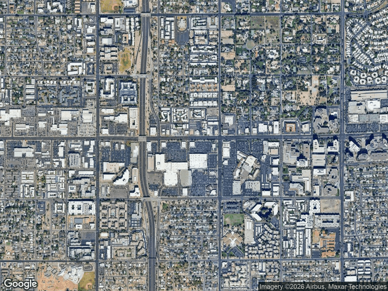
Choose a base map according to the assignment and final document. Dark or silver can reduce background detail, while satellite or terrain can provide additional physical context. Review the selected style at final size rather than assuming a reader response.
2. Optimize Map Label Customization CRE Viewers Expect
Subject property markers and nearby business labels need a clear hierarchy. Give the subject site a distinct label, then review nearby artwork and labels at the final export size. Keep the selected business context readable without implying that every label has an independent font control.
3. Apply Retail Map Styling Tips for Leader Lines
Leader lines connect reviewed artwork to map locations. When logos cluster around a dense shopping center, move them to available space and use leader lines to preserve the location connection. Verify each anchor point against the business location before exporting.
How to Fix Common CRE Retail Map Mistakes
Even with the best tools, poor design choices can ruin a map. Here are the most frequent mapping mistakes and how to fix them using solid retail map styling tips.
- Cluttered logos and overlapping text: This happens when you try to fit too many nearby businesses into a tight zoom level. Fix this by expanding your map canvas or using drag-to-group containers to organize brands into labeled retail clusters.
- Inconsistent line styles: Mixing dashed lines, thick solid lines, and random colors looks highly unprofessional. Stick to a uniform leader line design across your entire property map to maintain a cohesive brokerage brand.
- Lack of visual hierarchy: If your subject property looks exactly like the surrounding tenants, the viewer does not know what you are pitching. Emphasize the subject property marker and use custom color schemes that match your brokerage branding to make it pop.
- Overloading the map with data: Remember that visual maps are meant for context, not deep data analysis. Leave the demographic breakdowns, traffic counts, and GIS analysis for the subsequent pages of your OM. Keep your map strictly focused on visual retail context.
Best Practices to Customize Leader Lines Map Visuals
Review leader-line color, width, and pattern at the final output size. The editor provides these styling controls, but the right choice depends on the map style and document contrast. For the full workflow, use the step-by-step map guides.
Keep line treatment consistent unless you have tested a more complex scheme for legibility. Use grouping and labels to distinguish business categories. You can compare the available presentation controls on the CRE Retail Maps features page.
Conclusion
Clean leader-line design, logical label placement, and careful base-map selection make an offering memorandum easier to read. The Free plan in CRE Retail Maps supports building and previewing up to three maps. Pro downloads include 2D PNG/JPG up to 8,000 pixels, 3D images up to 4,096 pixels, and five PDF layouts.
CRE Retail Maps Editorial Team
VerifiedCRE Software & Industry Analysis
The CRE Retail Maps editorial team produces in-depth analysis of commercial real estate technology, retail market trends, and broker workflows. Our content is reviewed by retail brokers and industry practitioners with decades of combined experience covering grocery-anchored, power center, and lifestyle retail across major US markets.