



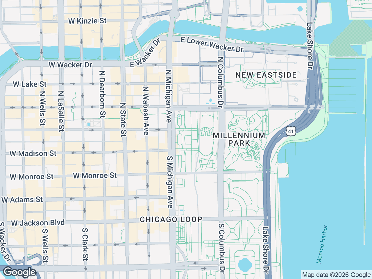
For a mixed-use development, a retail map can show ground-floor space and selected surrounding businesses. Residential, office, and entertainment context may belong in the accompanying narrative, with sourced evidence for any demand or traffic claim.
Why retail maps mixed-use development projects need a different approach
A standard retail site map often focuses on co-tenancy, access, and nearby brands. Mixed-use projects are more layered. A leasing map may need to support retail prospecting, while a marketing package may also speak to apartment renters, condo buyers, office tenants, lenders, and investors.
In a mixed-use environment, the ground floor is only part of the story. A map can help viewers ask:
- What retail and F&B options exist on-site?
- How does the project connect to surrounding anchors and daily-needs tenants?
- What other uses are nearby, and what separate evidence describes their activity?
- Which retail categories strengthen the live-work-play positioning?
A clear mixed-use property map distinguishes verified locations from conclusions that need separate analysis.
How to structure retail maps mixed-use development presentations
The best maps for mixed-use assets separate the retail message from the broader project story without making the visual feel crowded. Start by deciding what the map must do.
For most projects, you need to communicate three layers:
- The subject property and its branding
- The ground-floor retail and restaurant component
- The surrounding neighborhood retail ecosystem
If one map includes every possible input, it can become hard to read. Prioritize the reviewed location context relevant to the assignment and keep analytical conclusions with their supporting sources.
A good structure is:
- Mark the subject property clearly with a custom label
- Show the most relevant surrounding retailers and restaurants
- Emphasize verified categories relevant to the assignment, such as coffee, fitness, grocery, banking, or dining
- Group nearby brands into logical clusters when the trade area is dense
- Keep office, residential, and entertainment context in the narrative around the map, not as visual clutter on top of it
This is where a purpose-built tool like CRE Retail Maps can help. You can show reviewed brand artwork, leader lines, grouped tenants, and a clearly labeled subject property.
What to include on a mixed use tenant map
A useful mixed use tenant map should focus on the retail and customer-facing experience. It does not need to become a full GIS exhibit to be effective.
Include these elements:
- Subject property marker with the project name
- Ground-floor retail or restaurant positioning in relation to the site
- Reviewed national, regional, and local business locations selected for context
- Categories relevant to the project brief, without implying demand or performance
- A map style that matches the asset type and OM branding
For example, an urban mixed-use assignment may select coffee, dining, fitness, grocery, and service locations, while a neighborhood-serving assignment may select pharmacy, bank, grocery, and quick-service locations. Verify each business and choose the visible area according to the brief rather than a fixed distance.
The point of the map is not total data density. It is relevance.
How to build a ground floor retail map that stays readable
A ground floor retail map can show selected adjacency and nearby-business context. Visibility and customer-draw claims require separate current evidence.
The challenge is balancing detail with clarity. Mixed-use assets can sit in dense districts where dozens of brands compete for attention on the page. A few design choices make a major difference:
- Search the artwork library and verify the proposed brand match before placement
- Apply leader lines so logos do not cover streets or the property marker
- Group similar nearby tenants into labeled containers when an area is crowded
- Choose a map style that keeps roads and parcels legible without overpowering the logos
- Use a Pro export sized for its intended placement and review it inside the OM or pitch deck
This is especially helpful when you are showing restaurant rows, entertainment districts, or walkable retail nodes around a multifamily-over-retail project.
How to show multiple use types without confusing the retail story
A mixed-use retail map should not try to visualize every component equally. Select the reviewed site context and neighboring businesses relevant to the brief, and keep demand claims with their supporting analysis.
The cleanest approach is to let the map emphasize retail and use the accompanying copy to explain the other uses, such as:
- Number of residential units on-site or nearby
- Office square footage feeding daytime demand
- Hotel keys or entertainment venues supporting evening traffic
- Walkability and district-level live-work-play positioning
That way, the map stays focused on location context while the page or OM copy presents any separately supported market analysis. See our guide to retail maps for offering memorandums for document placement.
For residential leasing or condo marketing, the logic flips slightly. You still want the map to highlight retail and F&B, but the takeaway becomes convenience and lifestyle. In that context, coffee, grocery, fitness, pharmacy, and dining often matter more than full retail inventory.
Best categories to highlight around mixed-use projects
Not every surrounding business belongs on the map. Select categories relevant to the assignment without inferring visits, dwell time, or demand from proximity.
Usually that means:
- Coffee shops
- Restaurants and bars
- Grocery
- Fitness
- Banks
- Pharmacy
- Entertainment
- Service retail
These categories can show selected co-tenancy and nearby conveniences. They do not establish customer traffic or neighborhood quality on their own.
In CRE Retail Maps, search the visible map area by category, review and select relevant businesses, verify artwork, and organize the chosen items into a clear visual. The broader retail map software workflow can help teams standardize that process.
Common mistakes in mixed use property marketing maps
The biggest issues are usually not technical. They are judgment problems.
Avoid these common mistakes:
- Showing too many logos and creating visual noise
- Including irrelevant tenants just because they are nearby
- Making office or residential context compete visually with the retail message
- Using low-resolution exports that look soft in an OM
- Failing to label the subject property clearly
- Choosing a map style that hides streets, access, or brand placement
A mixed-use map should feel intentional. Every logo, label, and category should support the leasing or marketing narrative.
Conclusion
A mixed-use retail map should clearly show the subject property, the ground-floor retail opportunity, and selected surrounding businesses without claiming unsupported demand or performance. CRE Retail Maps provides nearby search, reviewed artwork candidates, leader lines, nine map styles, and Pro image and five-layout PDF exports. Free supports building and previewing up to three maps.
CRE Retail Maps Editorial Team
VerifiedCRE Software & Industry Analysis
The CRE Retail Maps editorial team produces in-depth analysis of commercial real estate technology, retail market trends, and broker workflows. Our content is reviewed by retail brokers and industry practitioners with decades of combined experience covering grocery-anchored, power center, and lifestyle retail across major US markets.