



Knowing how to present a retail map can make a client discussion easier to follow, but it does not determine whether a client signs a lease. This guide covers talking points, visual hierarchy, accuracy checks, and output choices for live and static presentations.
Why Your Ability to Present Retail Maps to Clients Matters
A client presentation can use a clear map to organize the subject property and selected nearby-business context. It does not validate the location, establish an opportunity, or determine the client's response.
Structuring Your Retail Map Presentation Layer by Layer
Pace the discussion so the client can inspect each claim. Start with the site, add reviewed nearby businesses, then discuss any separately sourced market evidence. The step-by-step guides cover the editor controls used to build those layers.
Layer 1: The Subject Property and Location Context
Start by zeroing in on the asset itself. Before discussing co-tenancy or trade area demographics, the client needs to understand exactly where the property sits in the physical market.
- Highlight the subject property with a prominent, clearly labeled marker so there is zero ambiguity.
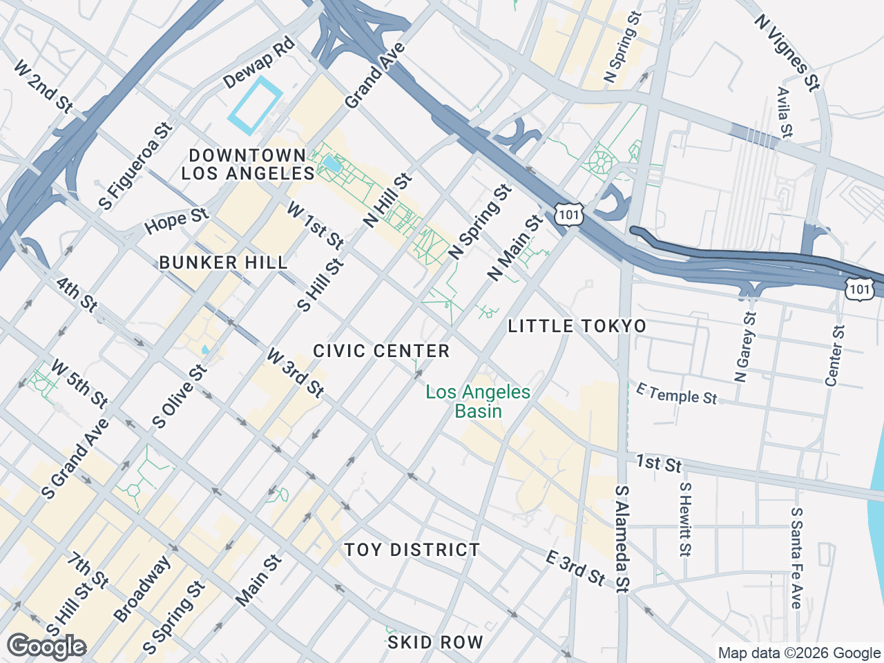
- Establish the immediate geographic context. Use a clean, light map style for offering memorandums or a satellite view for site tours to show highway access, physical barriers (like rivers or rail lines), and major intersections.
- Discuss access points visible on the map, then use separately sourced evidence for traffic flow and on-site checks for visibility.
Layer 2: Adding Verified Tenant Context
Once the client is grounded in the physical location, layer in the surrounding tenant mix. This is where retail co-tenancy comes to life.
- Search brand-artwork candidates, then verify the proposed match, tenant status, and business location before placement.
- Group nearby businesses logically using labeled clusters. For example, cluster a pad site's nearest neighbors together and label it "Outparcels" or group the national credit tenants under "Inline Tenants."
- Use leader lines connecting reviewed artwork to verified map anchors to keep the visual legible, even in dense retail corridors.
- Use this layer to answer a location question: "Which verified businesses are nearby?" Traffic and customer-draw claims need separate data.
Layer 3: The Competitive Landscape
Finally, zoom out to show selected competing locations. Explain how they were chosen and what remains outside the map.
- Frame the conversation around verified proximity. If you are pitching a QSR pad, show relevant nearby businesses, then evaluate traffic and competition with separate evidence.
- Remember that maps are conversation starters, not just decoration. Pause after showing the competitive landscape and ask: "How does this tenant mix align with your target demographic?"
- Ask which additional evidence the client needs to judge the location.
Screen and Projection Tips for Your Property Map Presentation
A beautiful map loses all its value if the client cannot read it from across a conference table. Optimizing your visual assets for the medium is a critical step.
- Export for the screen: Pro 2D PNG/JPG exports support custom dimensions up to 8,000 pixels, while 3D exports support up to 4,096 pixels. Test the actual file on the room's display.
- Choose the right map style for the room: Test Dark or Night and Light or Silver on the actual display or printout, then use the version with readable labels and artwork.
- Mind the color contrast: If you are displaying leader lines and clusters on a projector, ensure your custom color schemes provide enough contrast against the map background so they do not wash out.
- Test beforehand: Load your pitch deck on the conference room screen before the meeting. A map that looks perfect on your laptop monitor may look entirely different on a 75-inch TV.
How to Present Retail Maps to Clients in Pitch Decks
Your pitch deck, whether for an OM, a lease proposal, or an investment memo, requires a different approach from a live screen share. The map must stand alone without overstating what it proves.
- Apply your brokerage branding: Use custom color schemes that match your firm's brand guidelines so the property map presentation feels like a seamless extension of your corporate deck.
- Use an appropriate PDF layout: Pro includes five PDF layouts. Verify property and contact details and test the exported page in the full deck.
- Limit text on the slide: The map should be the visual hero. Let the leader lines and brand logos do the heavy lifting. Put your detailed demographic data and demographic analysis (sourced separately) on the following page.
Conclusion
Structure the presentation around the subject property, verified nearby businesses, and separately sourced market evidence. CRE Retail Maps provides searchable artwork candidates, grouping and leader-line controls, nine styles, and Pro image and five-layout PDF exports. Free supports building and previewing up to three maps; downloads require Pro.
CRE Retail Maps Editorial Team
VerifiedCRE Software & Industry Analysis
The CRE Retail Maps editorial team produces in-depth analysis of commercial real estate technology, retail market trends, and broker workflows. Our content is reviewed by retail brokers and industry practitioners with decades of combined experience covering grocery-anchored, power center, and lifestyle retail across major US markets.